I haven't felt the urge to talk so much about a products landing page since Superhuman or Pitch, until now. I want to discuss a unique approach from new consumer-based mobile and desktop app called Clay.
I've already spoken at some length about the various approaches with landing pages and their early access strategies but this is a little different as I haven't quite seen an approach like this before.
The product I'm about to discuss is called Clay - in its essence, Clay is a:
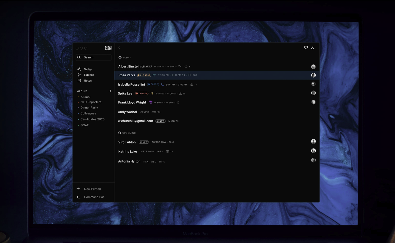
private rolodex that helps you remember and be more thoughtful with the people in your life.
The product itself is interesting, but i'm not going to focus on that. What I am going to focus on is their landing page, design, user experience, copy and their early access user journey.
Grab your 🐁 as we are about to get scrollin!
Let's break it down.
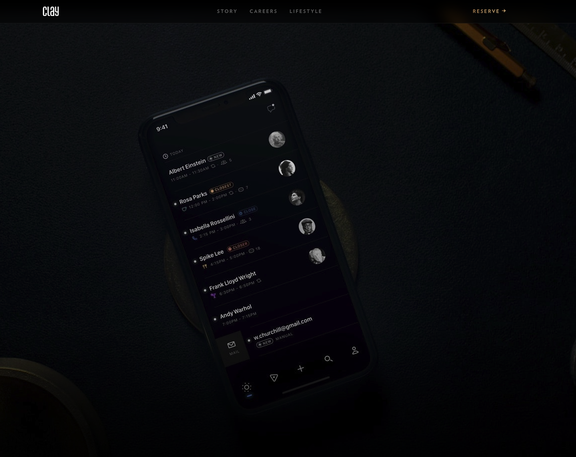
As soon as you visit the site you are presented with a slick dark themed interface with a low lit image of a mobile device laying flat with the backlit silhouette of the Clay app faintly showing. No large hero section with a prominent value proposition or glaring call to action - just the faint outline of a phone and the app. It can only be described as intriguing, as I don't yet know what the product is or does at this stage. This approach certainly breaks all the landing page best practises and marketing rules with web design but it certainly got me interested in learning more.
Your first reaction is to start scrolling instantly to find out more (and they obviously know this). So I start scrolling down and a parallax effect starts presenting copy explaining a little more about the product and a brief sneak peek at some of the features, but it's still not enough contextual information to get the complete picture of the product.
The mystic has got me curious. So I start scrolling again......
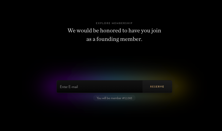
Now I'm presented with a prominent email capture field with a neon hue behind it, making it pop out of the screen. The copy above really catches my eye. It states that "We would be honoured to have you join as a founding member." What!!! "Honoured", me? and I will be a "founding member"? You gotta love the copy. This certainly beats the bog-standard 'Join now' any day.
Now I'm going to quickly skip entering the email for just now and quickly jump to exploring the rest of the page. We will come back to the email capture because I have a lot to talk about that.
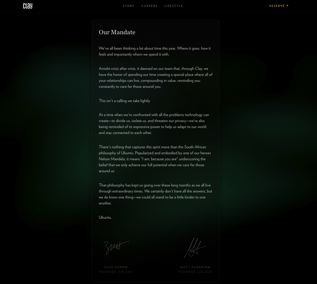
Right back to it. So I'm scrolling again..... and a "mandate" pops up. Gotta love a startup manifesto (Hey and MyMind also had great examples) but only a few consumer products get away with it before you see straight through it and notice it's just marketing fluff. However, in this particular case, it works.
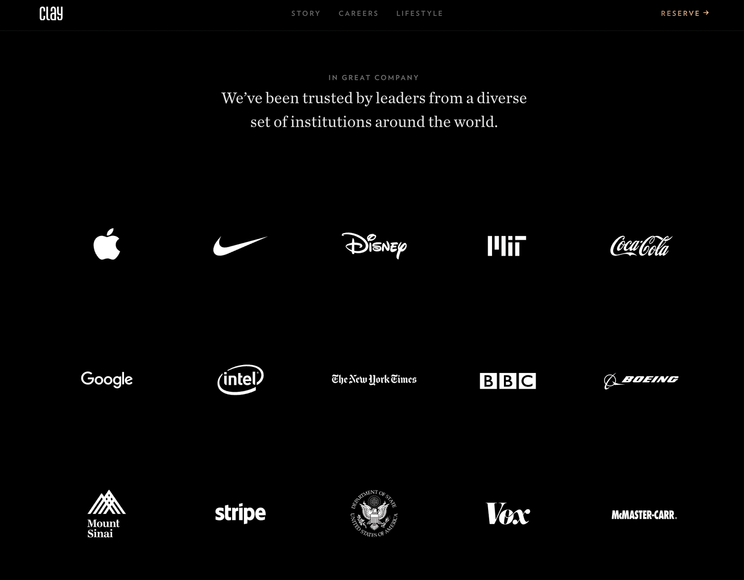
As we scroll down a little further we reach their "Trusted Partners" section. It's a pretty impressive roster of companies for such a new product. However, this section is a little confusing. Are they companies that have used Clay? Have some of the companies employees used Clay? or is Clay a sibling company of a larger product. This is a bit of a head scratcher, especially for a product that has yet to officially launch. Anyway, we won't dwell on this - let's move on and keep scrolling.
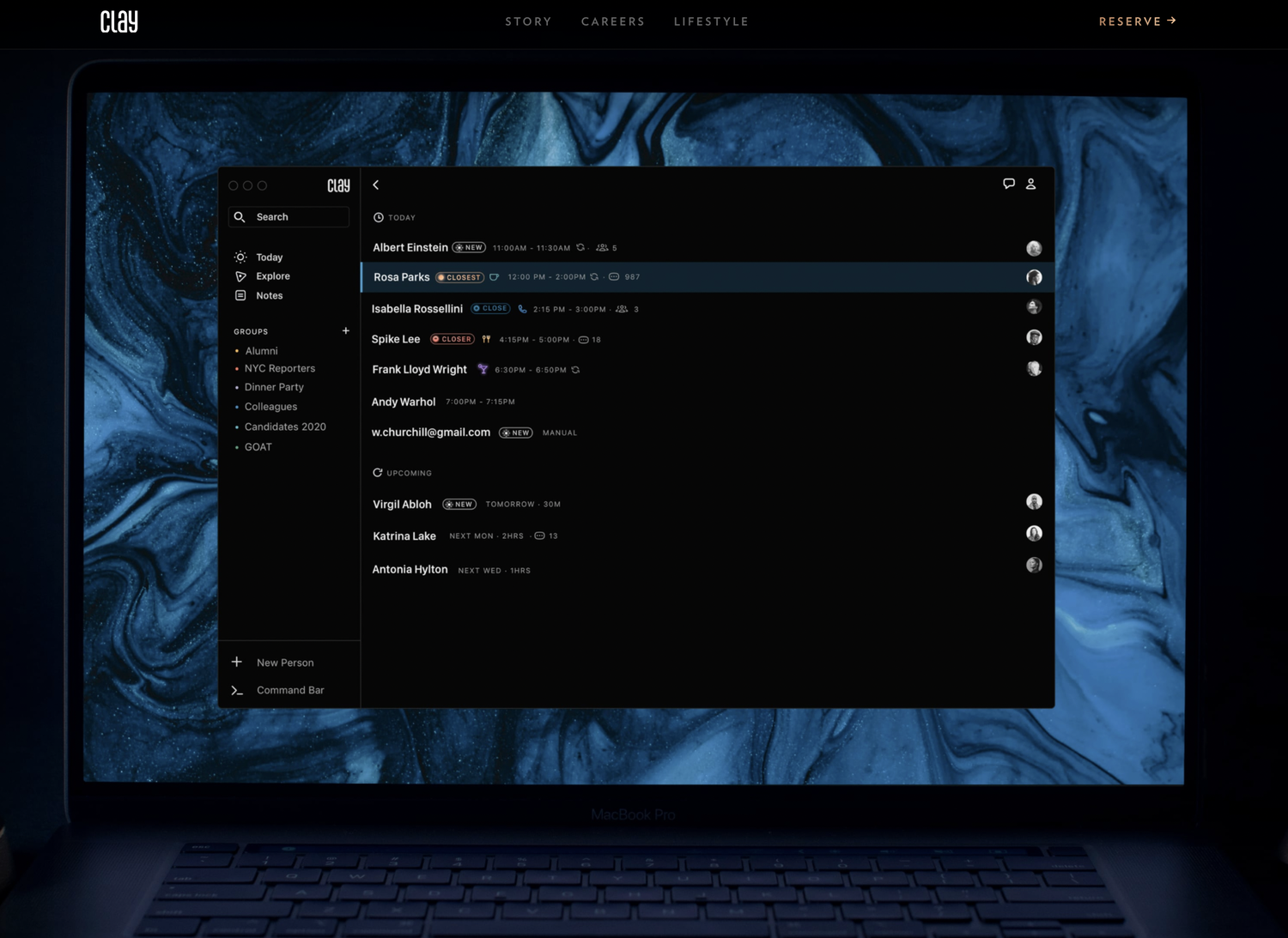
As we make our last scroll to the bottom of the site we get a sneak preview of their desktop application. It's a huge high quality image and certainly catches the eye. No list of features or benefits, just a big dark silhouette of a mac with the Clay app smack bang in the centre. I couldn't help myself and zoomed in 130% to see some of the design in more detail.
Right, back to the email capture and early access registration journey. This is where it gets real interesting.
So I enter my email and click the 'Reserve' CTA. My first assumption is i'm going to get added to a list and join a long line of nerds like me but I go ahead and click it anyway because I can't help myself.
And yes, I was right. I'm 12,036 on the list. Turns out there are a lot of others like me. Who knew.

However, I quickly notice this isn't my only option. "... you can skip ahead by joining now". So I curiously click the 'Join Now' CTA half expecting to jump into a referral programme where I can skip the line if I refer 5 friends or add 5 fake email address.
But I was wrong, again.
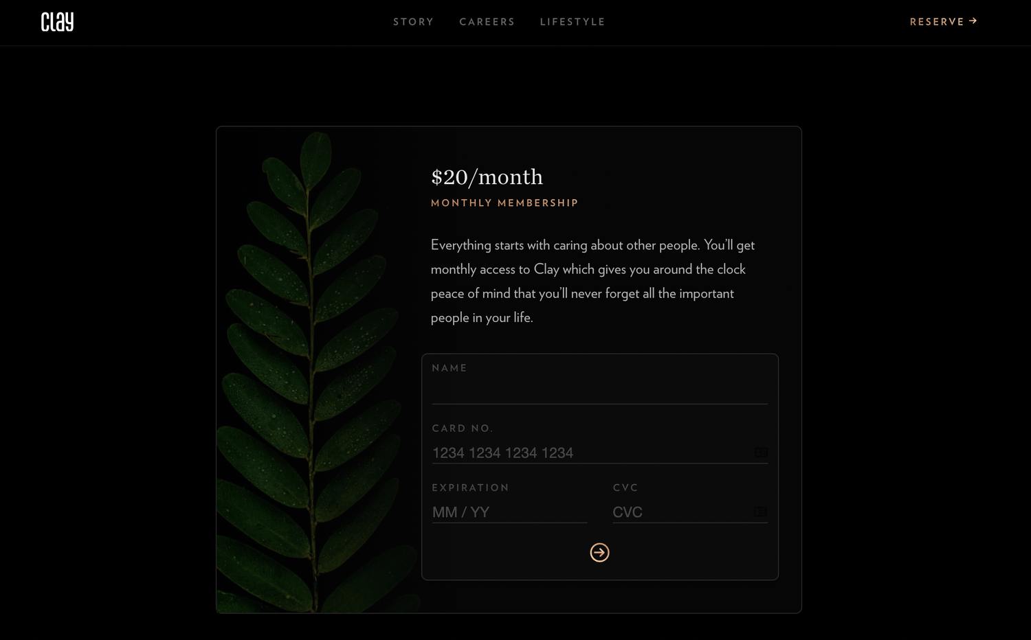
In fact i'm taken to a new screen where I have the option to pay now and get access. Awesome! But do I know when I will get access? no. This is a little confusing as I thought this wasn't launched yet. However, the ultimate form of validation is getting customers to pay for your product, but it's a tricky one to pull off during pre-sale phase. Some copy explaining when you will get access when you pay would certainly clarify this confusion and perhaps increase their pre-sales.
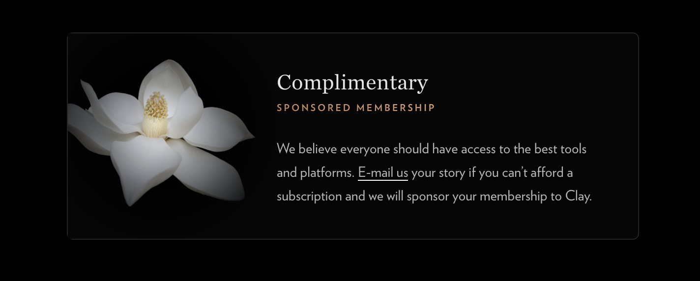
But it's not over yet. I notice some more text below the page fold, so I start scrolling....... 'Complimentary' mhm...., what is this? A sponsored membership? I haven't heard of this before but I love the idea. Seems like they will sponsor my membership if I can't afford the monthly subscription by emailing them a story. It's certainly a nice touch. I'm not entirely sure what stories they are expecting but i'm super curious how this plays out for them.
After a hard days scrolling and learning a new thing or two about creating landing pages and early access lists, I grab a coffee, hit the couch and ponder about what I liked and what could be improved.